Motion & Chart Race
🧊Third Dimension for Charts
🔢Per-Dimension Sorting
🎨Filter Button Colors
🖼️Custom Share Preview
August Release Highlights
August is a bigger release than usual. This month brings a chart race and fully overhauled motion properties for bar and column charts, a third dimension for Pie and Sankey dashlets, independent sorting for every dimension in the playground, custom colors for filter buttons, and a preview image of your choosing when public dashboards are shared on social media. Alongside these, our team has successfully resolved 249 issues to keep the overall platform running smoothly.
Motion Properties, Overhauled — Meet the Chart Race
Motion on a dashlet used to be a single, fixed behavior. We rebuilt the motion properties from the ground up and, along the way, added the feature everyone asks for: a chart race. Bar and column charts can now animate through a time dimension (or any other ordered one), with bars re-ranking and overtaking each other step by step — the kind of visual story that makes a trend impossible to miss.
Words do not do motion justice — watch the one-minute video below to see the chart race and the new motion styles in action.
The new chart race and motion styles on a column chart, in one minute.
1. Chart Race for Bar & Column Charts
Enable motion on a bar or column chart and it becomes a race: categories re-sort on every step, so the leader at each point in time is always on top. Ideal for market share over the years, campaign results week by week, or any “who is leading right now” question.
2. Four Motion Styles
Choose how the animation feels from four distinct motion styles — each a different UX for how values transition between steps and how the sequence plays out. Pick the one that matches the pace and the mood of your dashboard, from a smooth, continuous flow to clear, frame-by-frame changes.
3. Filter Value Placement
The animated filter value — the year, month, or step currently on screen — can now be positioned where you want it on the dashlet, so the label stays readable and never competes with the chart itself.
Then try it yourself: open this public dashboard, press play, and watch the race run live.
A Third Dimension for Pie & Sankey Dashlets
Charts in TURBOARD have long worked with two dimensions. With this release, Pie and Sankey dashlets accept a third one. Add it in the playground like any other dimension, and the chart grows a level.
A Sankey gains a third column of nodes, so flows can be traced from a source, through an intermediate stage, to a final outcome — for example, category → launch year → status. A Pie becomes a three-ring sunburst: the inner ring holds the main category, and each outer ring breaks it down one level further.
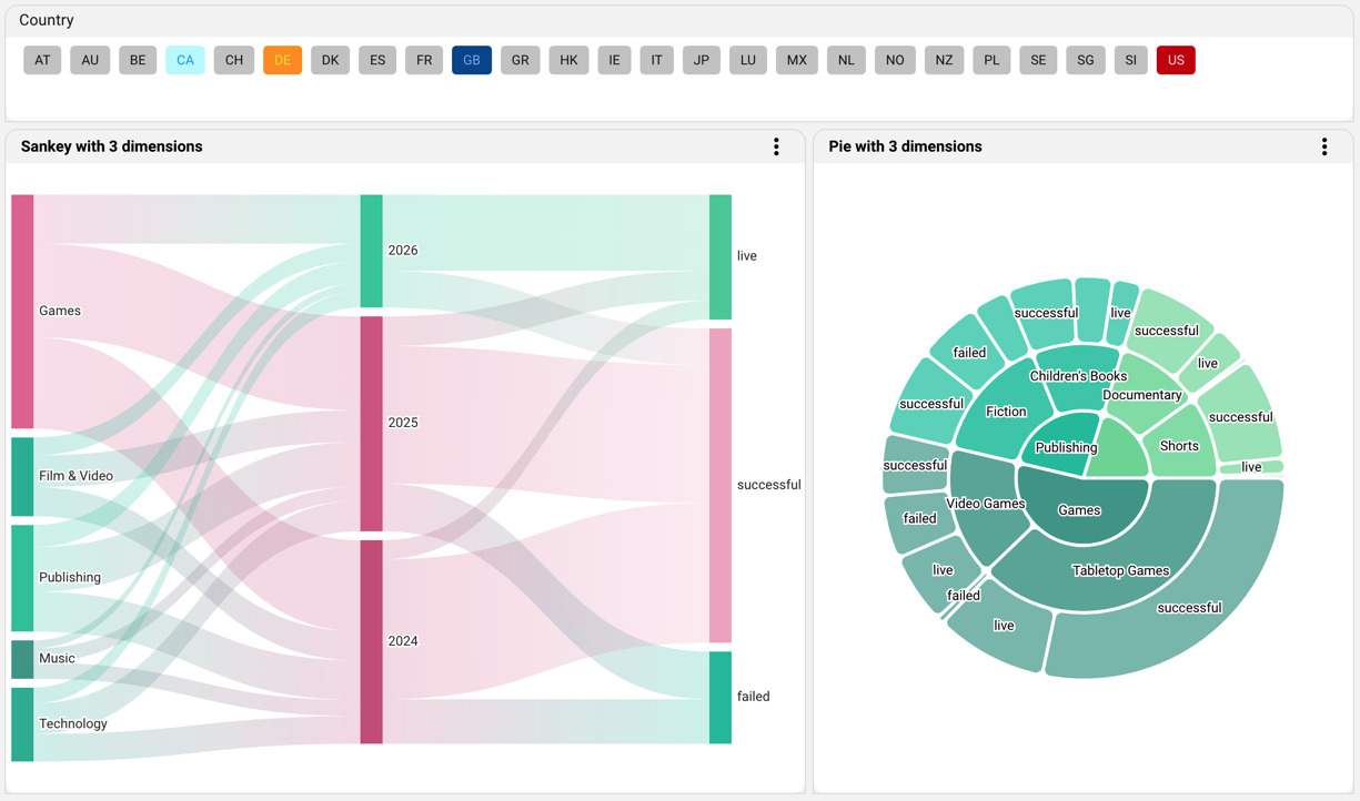
A Sankey and a Pie, each built on three dimensions — category, year, and status — side by side. The colored Country filter buttons above them are covered further down.
Sort Every Dimension Your Way
A third dimension only pays off when you can control how each level is ordered. Until now, the sort you set in the playground applied to the primary dimension, while the secondary and tertiary dimensions fell back to the default order coming from the view.
That is no longer the case. The Sort Order control in the playground now lists every dimension on the dashlet, and each one gets its own choice of Value (Ascending / Descending) or Alphabetical (Ascending / Descending). Combine it with the per-dimension limits sitting right beside it, and a three-level chart stays tidy and readable — the top five categories by value, years in order, and outcomes with the largest share first.
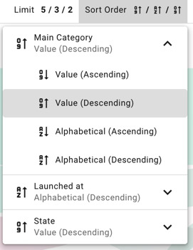
Sort Order in the playground now offers an independent setting for each dimension, right next to the per-dimension limits.
See the three-dimension charts and their sorting on this public dashboard.
Custom Colors for Filter Buttons
Filter widgets shown as buttons are a favorite for quick, at-a-glance selection — and now they can carry meaning through color. On the Edit Filter screen, a new Button Colors section lets designers pick any value of the filter and give it its own background and text color.
Highlight the markets you care about, match your brand palette, or mirror the colors used in the dashlets below, so the filter and the charts tell the same story. Values you leave untouched simply keep the default look, and color mappings can be exported and imported, so a palette defined once is easy to reuse across dashboards.

Button Colors on the Edit Filter screen: pick a value, then set its background and text color. The result is the colored Country filter shown in the three-dimension screenshot above.
Your Own Preview Image for Shared Links
When a public dashboard link is shared on LinkedIn, X, WhatsApp, or any platform that renders link previews, the picture shown is its Open Graph (OG) image. Until now, that was always the automatic thumbnail of the visualization.
From this release, you decide. Open the Share dialog on any public element, hover over the preview, and click the pencil icon to upload the image you want to represent it — a branded cover, the one chart that matters, or a call to action. For best results, use an image with an aspect ratio close to 1.91:1, so it is displayed in full without cropping in social feeds.
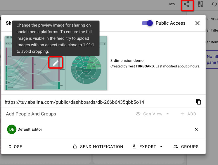
In the Share dialog, click the pencil icon on the preview to replace the image shown when the link is shared on social media.
Принесите один реальный бизнес-вопрос. Посмотрите, как на него ответит TURBOARD.
Мы демонстрируем JAS на ваших отчётах, ваших определениях и вашем контексте безопасности — а не на типовой демонстрационной базе.